
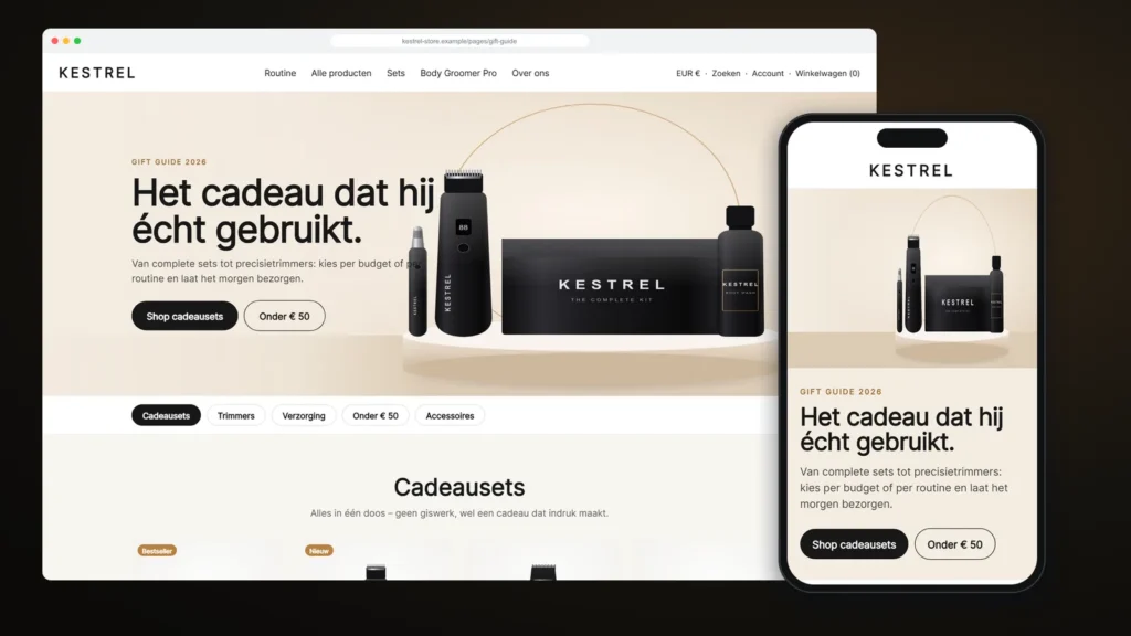
The message came in on a Monday in early autumn, with two links and a deadline. The founder of a Dutch men’s grooming brand, which we will call Kestrel, had been studying a much larger international competitor. We want pages like these, the message said, before the gift season starts. But we don’t want a new theme, and we don’t want five more apps.
That brief is one we hear often from Shopify merchants: the store works, the theme is fine, but the pages that matter most in a peak season (gift guides, campaign landing pages, bundle collections) look like everyone else’s. This case study walks through how we answered it with a set of Shopify custom sections and page templates: the design decisions, the Liquid code, the bugs we hit and the way the merchant now edits everything themselves in the theme editor.
About this case study: it is a composite based on real Shopify project work. The brand name, product photography and some details have been changed, and the product images are illustrations. The code patterns, problems and fixes are exactly as we handled them.
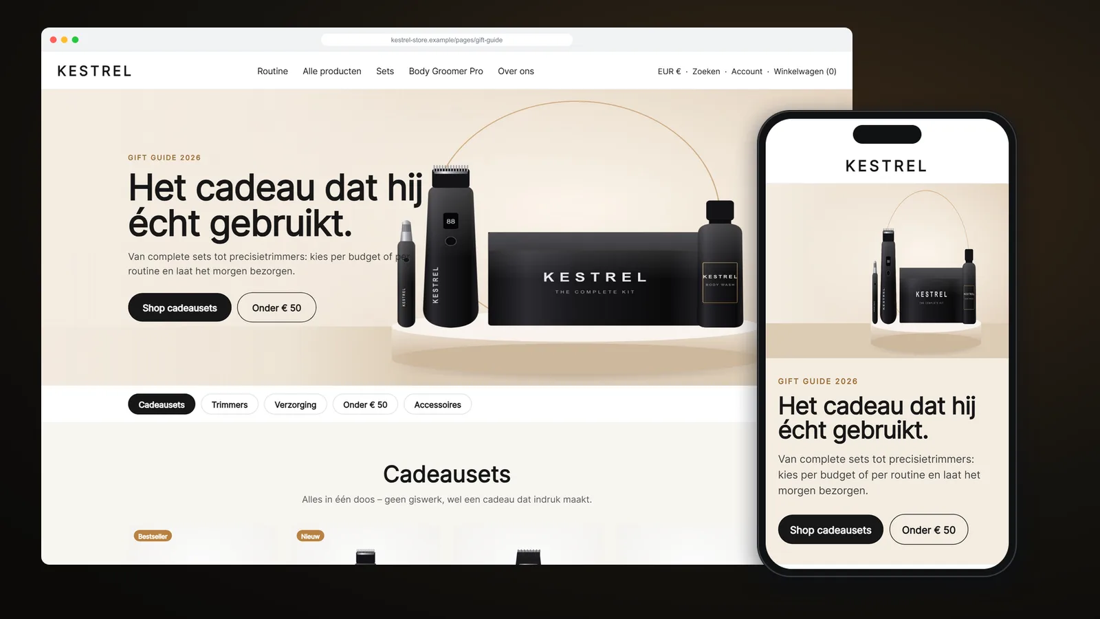
The project at a glance
| Client | Direct-to-consumer men’s grooming brand, Netherlands (Dutch storefront, EUR) |
| Platform | Shopify, Online Store 2.0, existing premium theme kept in place |
| Scope | 7 custom sections, 2 snippets, 3 templates, 2 small additive edits to theme files |
| Pages delivered | Gift guide, homepage hero tiles, homepage spotlight gallery and feature carousel, Deals & Kits collection, Bestsellers page |
| Constraints | No new apps, no theme switch, no change to existing collection pages, everything editable in the theme editor |
| Extras | Campaign hero and slide imagery, installation guide, Theme Check clean |
The brief: what the store needed, and what it did not
The store already had a good premium theme with solid product pages, a cart drawer, filtering and fast checkout. Nothing needed rebuilding. What was missing were merchandising pages: layouts that tell a story, group products by intent, and push a visitor gently towards a set or a bundle rather than a single item.
From the reference pages and a call with the founder, we wrote down five concrete needs:
- A gift guide that groups products by category and budget, with jump links that stay visible while you scroll.
- A stronger homepage banner: one large campaign tile plus smaller tiles linking to bundles and bestsellers.
- A product “spotlight” carousel on the homepage that explains the technology behind each device, with an add-to-cart button on every slide.
- A Deals & Kits collection with a branded header and a promotional card inside the product grid, without losing the existing filters.
- A Bestsellers page with curated rows, not just another collection grid.
Just as important was what the client did not want: no page-builder app injecting scripts on every page, no theme migration in the middle of the season, and no developer dependency for changing a headline or swapping a product.
Why Shopify custom sections beat a page builder or a new theme
Online Store 2.0 made Shopify sections the natural unit of customisation. A section is a Liquid file with its own settings schema, so once it is installed the merchant can add it to any page from the theme editor, reorder it, duplicate it and change every text, image, colour and spacing value without code.
Compared with the alternatives, custom sections gave this client three advantages:
- Performance. Each section ships only the CSS and JavaScript it needs, and only on pages where it is used. There is no app script loading site-wide.
- Ownership. The code lives in the merchant’s own theme. No monthly fee, and nothing disappears if an app is uninstalled.
- Consistency. The sections reuse the theme’s own product card, buttons, typography and cart form, so new pages look and behave like the rest of the store.
The trade-off is that sections have to be built carefully: they must survive theme updates, work with the theme’s existing CSS, and stay editable by someone who will never open a code file. Most of the work described below is about getting those details right.
1. A gift guide page template built from reusable sections
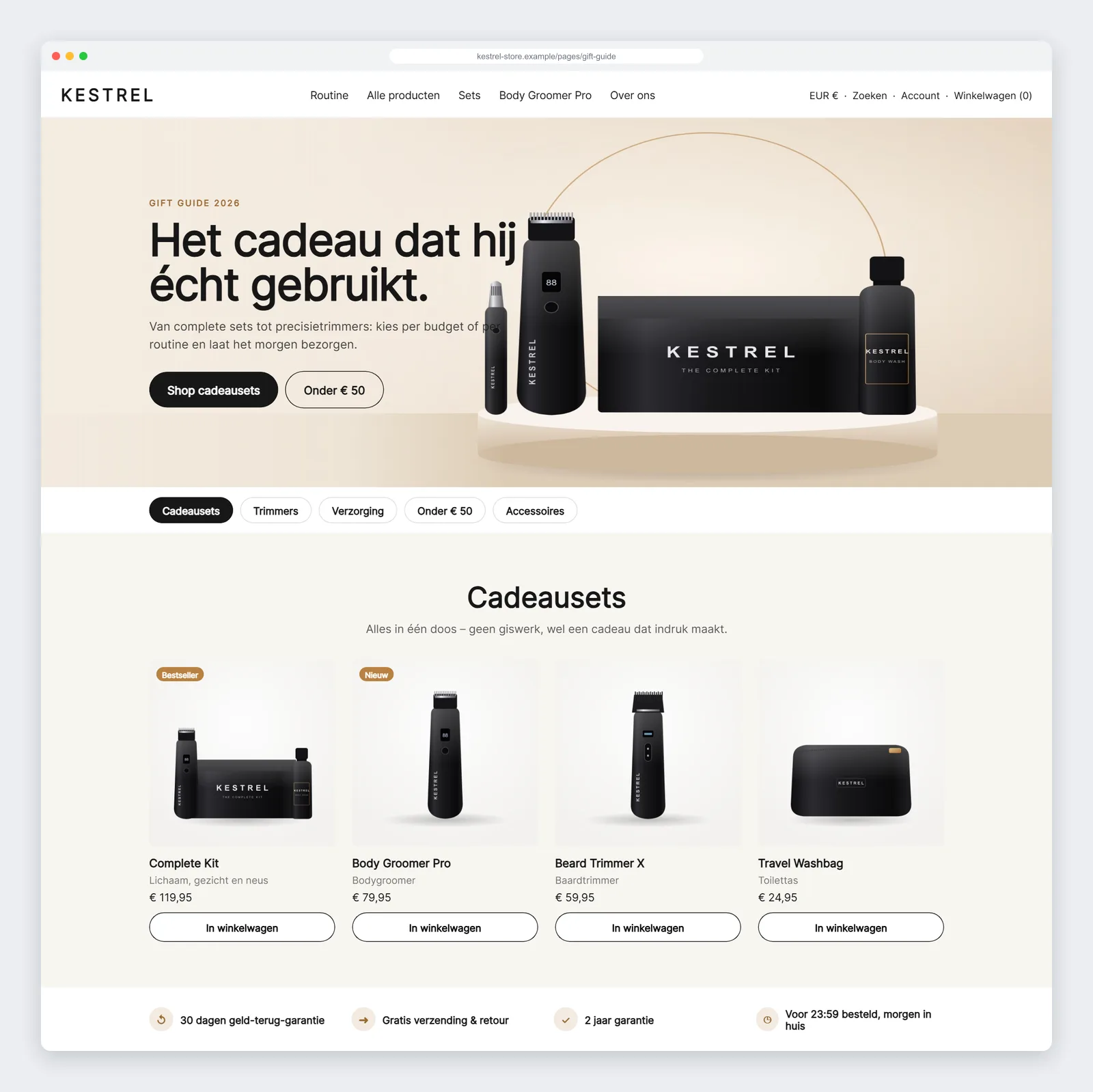
Rather than one large “gift guide section”, we split the page into four small sections that the client can combine freely:
- Gift guide hero: separate desktop and mobile images with focal points, overlay styles, and subheading, heading, text and button blocks.
- Jump links: a sticky bar that builds itself from the product sections on the page and highlights the category currently in view.
- Category products: a product row fed by a collection or a hand-picked list, using the theme’s own product card, with optional promo tiles and swipe on mobile.
- Trust bar: four short promises (money-back guarantee, free shipping and returns, warranty, next-day delivery) with icons.
The jump-link bar is a good example of designing for the person who edits the page. Instead of asking the client to maintain a list of links, every product section has an anchor_id and a navigation label. The bar reads them on page load, so adding a new category to the guide automatically adds a new link, in the right order.
// Build the jump links from every gift-guide product section on the page.
const targets = [...document.querySelectorAll('[data-gg-category]')];
targets.forEach((section) => {
  const link = document.createElement('a');
  link.href = '#' + section.id;
  link.textContent = section.dataset.ggLabel;
  list.appendChild(link);
});
The page itself is a JSON template, page.gift-guide.json. Once it is assigned to a page in the admin, the client can create a second guide next year, or a Father’s Day guide, by duplicating the page and changing the products. No developer is needed.
2. Homepage hero tiles: one campaign, two shortcuts
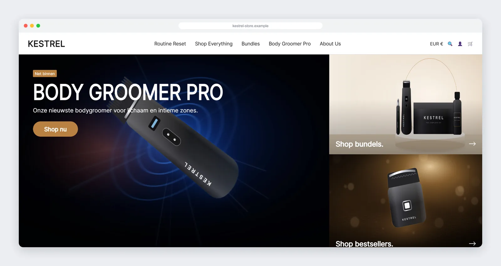
The second request was a homepage banner that does more than show one image. The hero tiles section has one large tile (badge, condensed uppercase heading, text, button) and one to three stacked link tiles on the right, each with its own image and an arrow label.
Everything is controlled from the editor: the main tile’s width on desktop, heights for desktop and mobile separately, content position for each breakpoint, overlay strength, corner radius and colours. On mobile the tiles stack, and the main tile gets its own height so the campaign stays visible above the fold.
This section has no JavaScript at all. A homepage banner does not need it, and leaving it out keeps the most important part of the page as fast as possible.
3. The spotlight gallery, and the bug that hid its heading
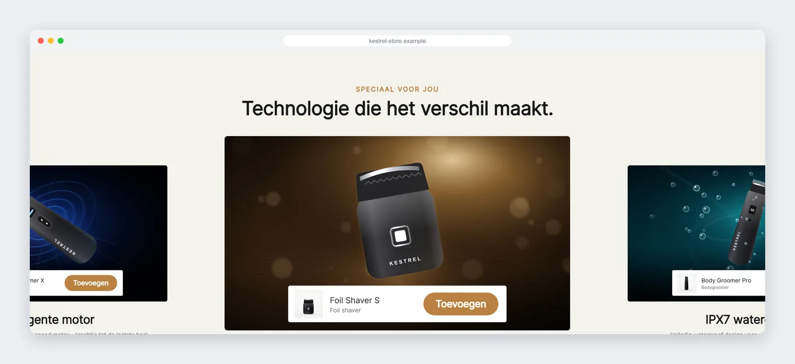
The most interactive piece was a “spotlight” carousel. Each slide pairs a dark, cinematic product image with a short benefit (motor, skin comfort, waterproofing) and a product bar where the visitor can add the item to the cart without leaving the homepage.
Behind the simple look there is a fair amount of behaviour:
- The active slide is centred, and neighbouring slides are scaled down and partly visible, which invites a swipe.
- Drag and swipe, keyboard arrows, clicking a side slide, optional autoplay and looping all work.
- Inactive slides are removed from the tab order, so keyboard and screen-reader users only interact with the visible slide.
- The add-to-cart button uses the theme’s own AJAX product form, so the existing cart drawer opens exactly as it does on product pages.
The heading that would not show
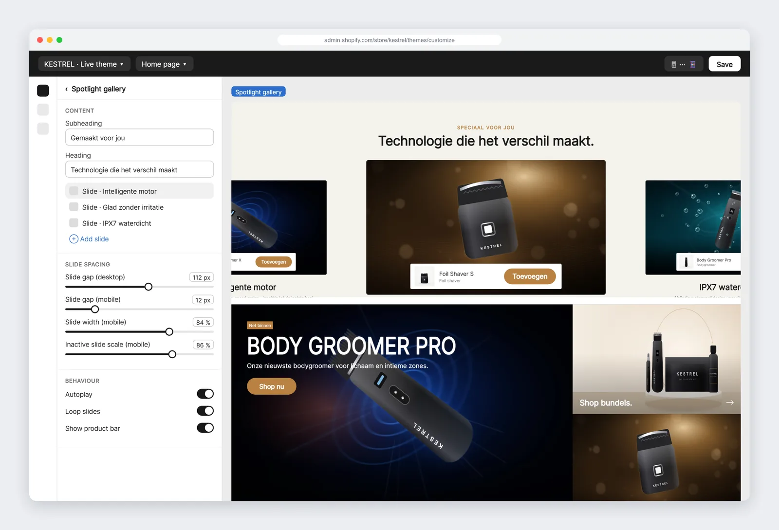
After the first install, the client sent a screenshot: the slides worked, but the section heading, subheading and pagination were invisible, and the slide spacing setting seemed to do nothing. On our test store everything looked fine.
There turned out to be three separate causes, and they are worth sharing because they affect many custom sections on premium themes:
- The theme’s background layer. This theme paints section backgrounds with an absolutely positioned
::beforeelement. Any content inside the section that is not itself positioned sits underneath that layer, so it is invisible even though it is in the HTML. - A stale stylesheet bundle. Shopify compiles the
{% stylesheet %}tags of all sections into one cached file. Our fix had been deployed, but the client’s browser was still receiving the old bundle. - Empty new settings. When you add a setting to a section that is already placed on a page, the existing instance does not get the new default. The value is empty, so the CSS received
pxinstead of112px, and the gap became zero.
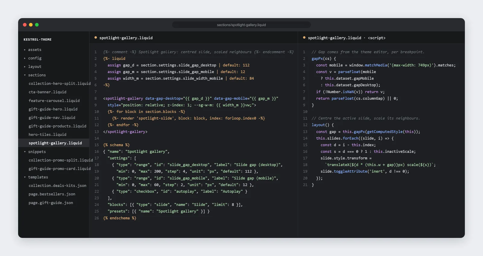
The fix addressed all three. Content is lifted above the background layer, critical CSS is output inline with the section so it can never be served stale, and every setting has an explicit fallback in Liquid:
{%- liquid
  assign gap_desktop = section.settings.slide_gap_desktop | default: 112
  assign gap_mobile = section.settings.slide_gap_mobile | default: 12
-%}

<style>
  /* Keep content above the theme's .section::before background layer. */
  #shopify-section-{{ section.id }} .sg > * { position: relative; z-index: 1; }
</style>

<spotlight-gallery data-gap-desktop="{{ gap_desktop }}" data-gap-mobile="{{ gap_mobile }}">
The gap is now passed to JavaScript as data attributes, with separate values for desktop and mobile, because the carousel calculates slide positions in pixels:
We applied the same background-layer rule to every other custom section in the project before the client could run into it again. This is the kind of issue that only shows up on a real store with real content, which is why we always test on a duplicate of the live theme rather than on a clean demo.
4. A Deals & Kits collection template that keeps the filters
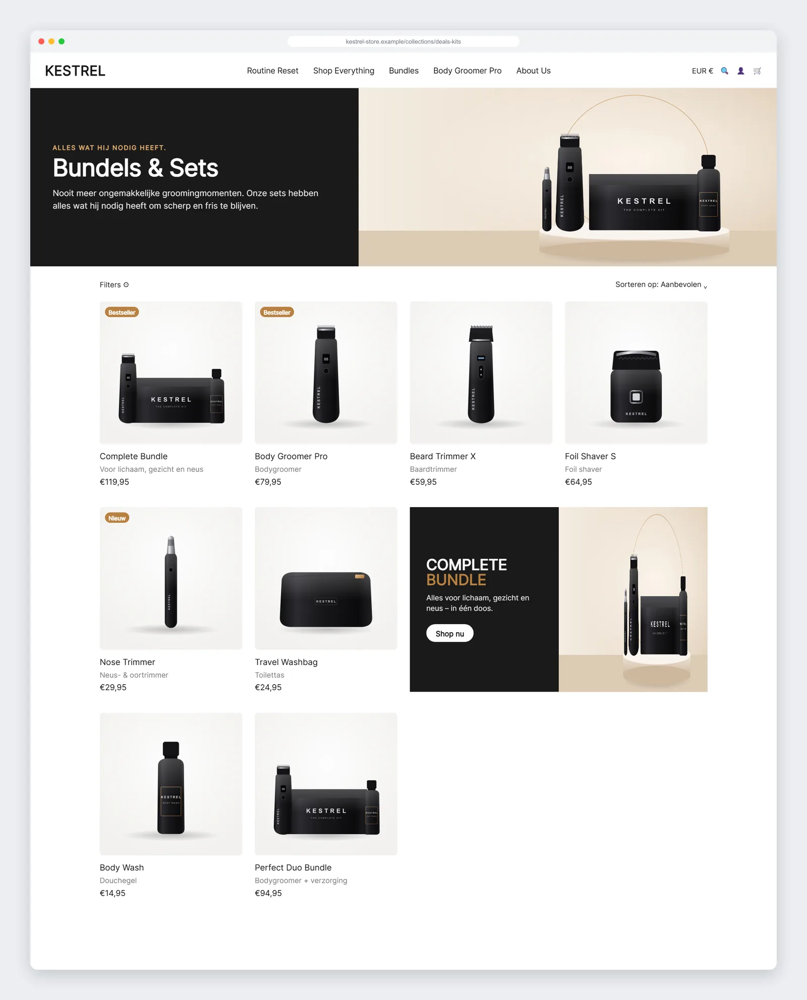
For the bundles collection, the client wanted a branded header and a large promotional card in the middle of the product grid, while keeping the theme’s filtering, sorting and infinite scroll exactly as they were.
We built this as a new collection template, collection.deals-kits.json, with two pieces:
- A split collection header that is dynamic by default. The heading falls back to the collection title, the text to the collection description, and the image to the collection image or the first product image. Any collection can use the template without extra setup.
- A “Promotion (split)” block for the theme’s main collection section. The merchant chooses the position in the grid (for example, after the sixth product), the product to feature, an image, the copy and the colours. On desktop it spans two columns; on mobile it takes a full row.
Does editing core theme files affect other collections?
This was the client’s first question, and the right one to ask. The answer was no, because both edits were strictly additive:
- The main collection section gained a new block type. Existing collection templates do not contain that block, so they render exactly as before.
- The product card gained an optional subtitle line that only appears when a product has a value in a
custom.subtitlemetafield. Products without it are unchanged.
We still recommended previewing on a duplicate theme first. That is part of our standard installation process, described below.
5. A Bestsellers page assembled from existing parts
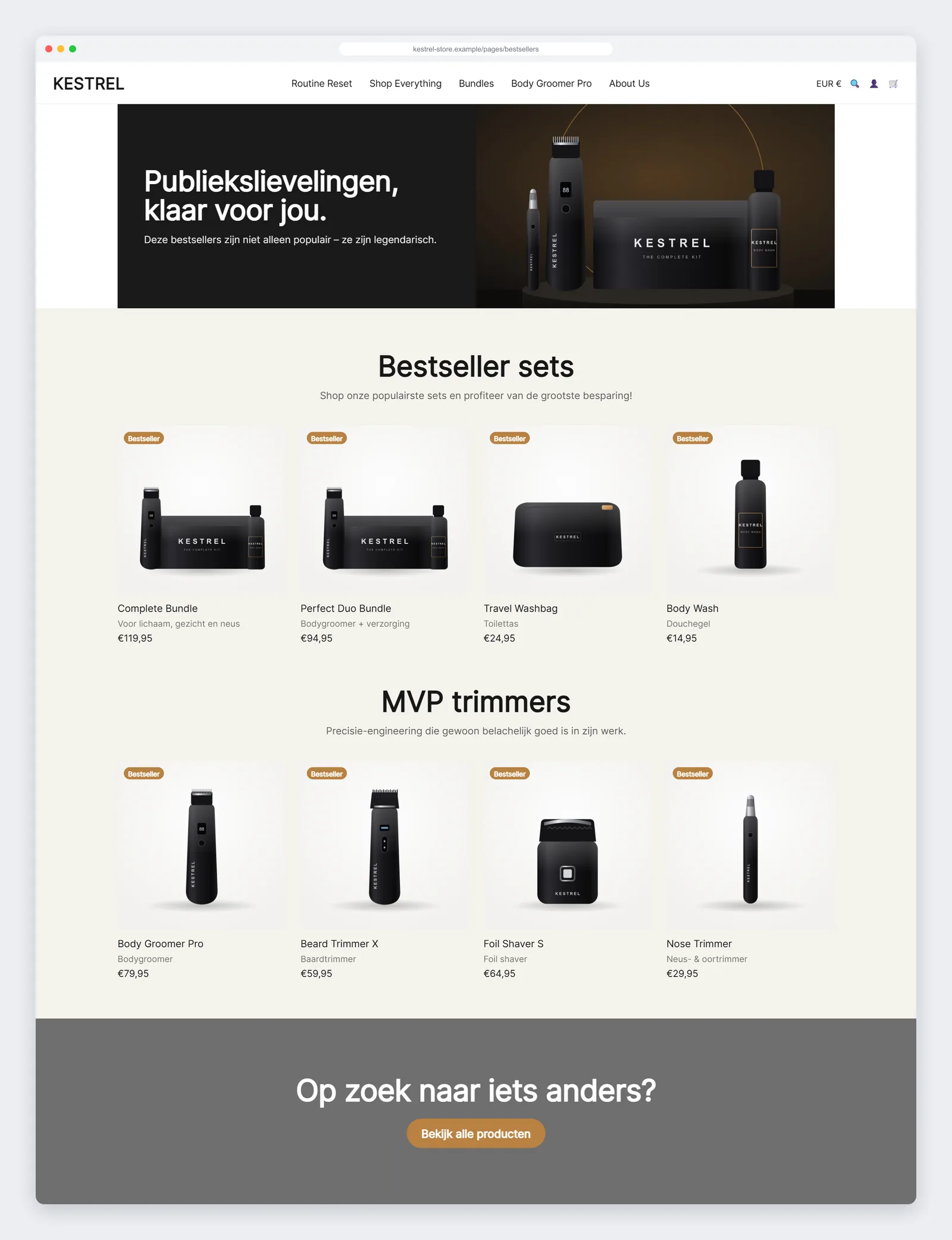
The last page in the project shows the real return on building sections properly. The Bestsellers page needed only one new section, a simple call-to-action banner (“Looking for something else?”). Everything else was reused:
- The split header from the collection template, here with a dark product banner and no breadcrumb.
- Two instances of the gift guide product row, “Bestseller sets” and “MVP trimmers”, switched to a static grid instead of a carousel.
- The new CTA banner, linking to all products.
Building the page took a fraction of the time of the first one, and the client can now assemble similar landing pages for campaigns on their own.
Mobile first, not mobile after
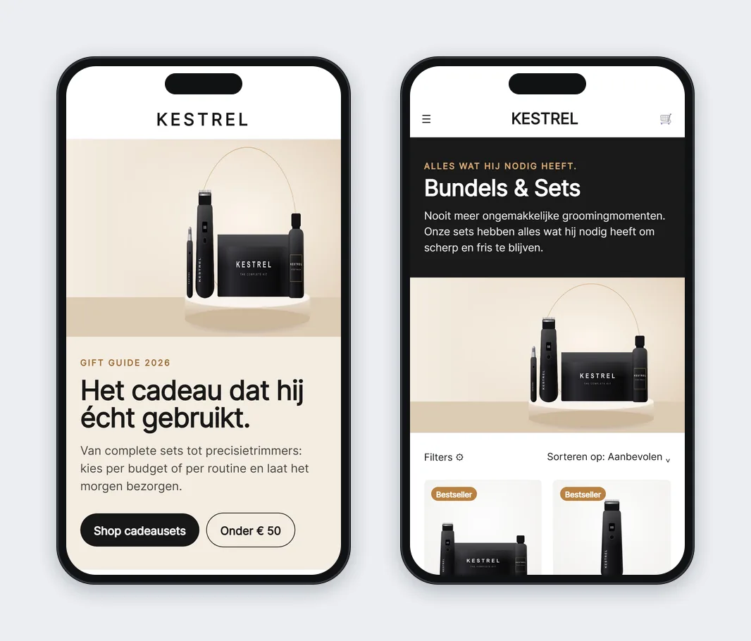
Most of this store’s traffic is on phones, so every section has explicit mobile settings rather than simply shrinking the desktop layout:
- Separate mobile images and focal points for heroes.
- Product rows that turn into swipeable carousels on mobile, with an adjustable card width so the next product peeks in from the edge.
- Different slide gaps, slide widths and scaling for the spotlight gallery on mobile.
- Promo cards that take a full row on small screens, so the copy stays readable.
How we install custom sections without risking the live store
A custom section is only valuable if it can go live safely. For this project, as for every Shopify theme job we take on, the process was:
- Duplicate the live theme and work only in the copy.
- Add the new files (sections, snippets and templates) through the code editor. Templates go last, because they reference the sections.
- Assign the templates to a test page and a test collection, and fill them with real products and copy.
- Run Theme Check and fix every error and warning that matters.
- Preview on real devices, share the preview link with the client, and collect feedback.
- Publish the duplicate when it is approved, keeping the previous theme as an instant rollback.
The client also received written installation notes: which file goes where, which settings to check, and how to assign each template. If they want to move the sections to a new theme later, they know exactly what to copy.
Quality checklist we used
- Theme Check clean: no Liquid errors, no missing translations, no deprecated tags.
- Defaults everywhere: every setting has a sensible fallback, so a section never breaks when a field is left empty.
- Theme-native components: product cards, buttons and the cart form come from the theme, so updates and app integrations keep working.
- Accessibility basics: real buttons, keyboard navigation for the carousel, hidden slides removed from the tab order, alt text on every image.
- Performance: responsive images with
srcset, lazy loading below the fold, JavaScript only where interaction needs it, and no new apps.
What to measure after launch
Custom pages are an investment, so they should be measured. We do not publish conversion figures for client projects, and a single season would not prove much anyway. What we set up with the client was a short list of metrics to compare against the previous season in Shopify Analytics and GA4:
- Click-through from the homepage hero tiles and spotlight gallery to product pages.
- Add-to-cart events fired directly from the spotlight product bar.
- Share of orders that include a set or bundle (the main goal of the Deals & Kits and gift guide pages).
- Average order value during the gift season.
- Mobile engagement on the gift guide: scroll depth and jump-link use.
Tracking these numbers turns “we have nicer pages” into a clear answer about which sections earn their place and which should change next season.
Need custom Shopify sections or page templates?
This project is a typical example of our Shopify theme development work. We help merchants who are happy with their theme but need pages that sell better, without the cost and risk of a full redesign. A typical engagement includes:
| Service | What you get |
|---|---|
| Single custom section | One section (for example a carousel, banner, comparison table or FAQ) with full theme-editor settings, mobile layout and installation on a duplicate theme. |
| Landing or campaign page template | A JSON page template made of several sections, such as a gift guide, launch page or bestsellers page, that your team can duplicate for future campaigns. |
| Collection template upgrade | Custom collection headers, promo blocks inside the grid, or product-card additions, with existing filters and sorting kept intact. |
| Section library | A set of matching sections built once and reused across the store, as in this project. |
Every project comes with a fixed-scope quote, a preview link before anything goes live, Theme Check-clean code, and handover notes your team can follow. We also create campaign imagery when needed, as we did for the hero and spotlight slides here.
Have a reference page you love, or a season coming up? Let’s Talk. Send us the link and your store URL, and we will tell you plainly what it takes to build it in your theme.
Frequently asked questions
What is a custom section in Shopify?
A section is a reusable building block of a Shopify Online Store 2.0 theme: a Liquid file with its own settings. A custom section is one built specifically for your store. Once it is installed, you can add it to pages, move it and edit its content in the theme editor, just like the sections that came with your theme.
Will custom sections break when I update my theme?
Sections added as new files are not overwritten by a theme update. When you install a new theme version, you copy the custom files into it, which is why we provide installation notes. Edits to the theme’s own files should be kept small and additive, so they are easy to reapply.
Do I need an app for gift guides or carousels?
Usually not. Gift guides, carousels, banners and promo blocks can all be built as native sections. That avoids monthly app fees and extra scripts loading on every page.
Can my team edit the pages without a developer?
Yes, that is the main point of building them as sections. Text, images, products, colours, spacing and layout options are exposed as settings in the theme editor. A developer is only needed when you want a new kind of layout.
Will custom sections slow down my store?
Well-built sections add very little weight, because they load their CSS and JavaScript only on pages that use them and rely on the theme’s existing components. In most cases they are lighter than the app-based alternative.
Which Shopify themes do you work with?
Any Online Store 2.0 theme, including Shopify’s free themes and premium themes from the Theme Store. We match the section code and design to your theme’s own conventions, so the result looks native.